Documentation, guides, and support
Documentation
Spotlight

Product videos and tutorials
Discover Generation Impact Global’s suite of products and our digital ecosystem.
Learn moreConfiguration
Creating portfolio companies
To create a new company:
3. On the Company management page click + Add company.
Configuration
Adding portfolio companies
Accessing the Feature
Navigate to:
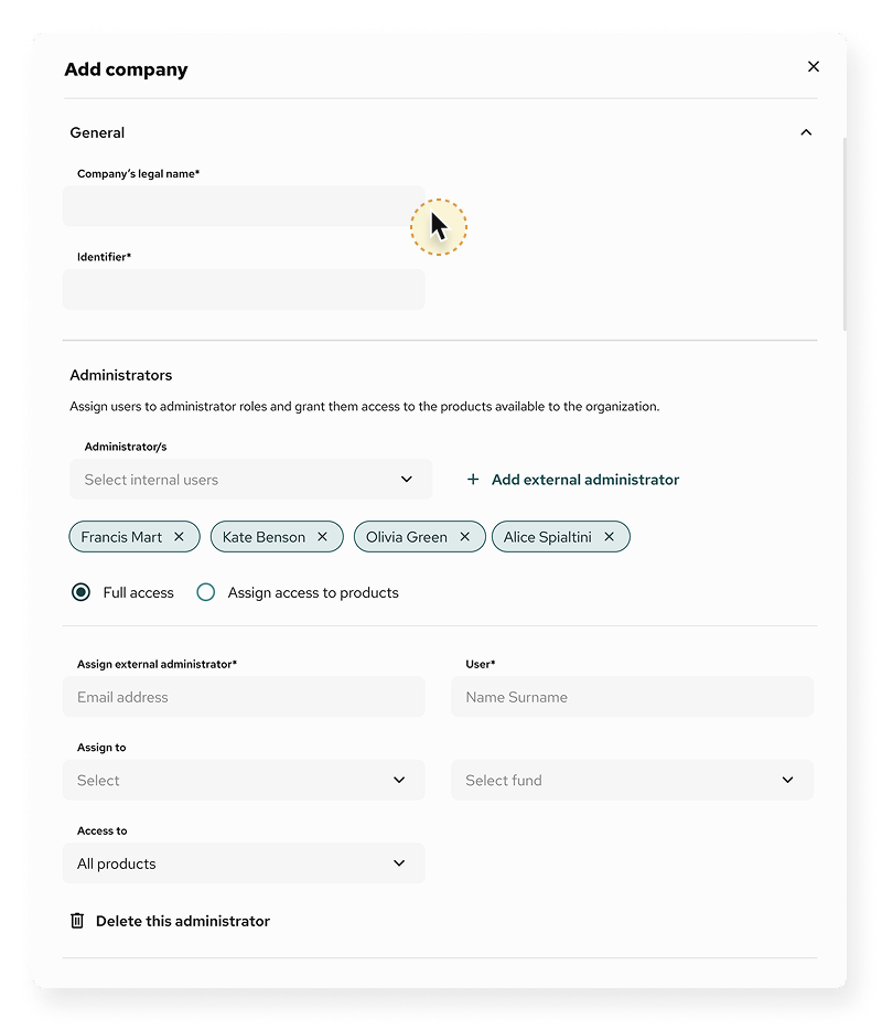
Company Management → Click + Add Company (top-right corner). A full-screen form will appear, allowing you to complete company details across multiple sections.
- Company’s legal name (required)
Full registered name of the company. - Identifier
Optional internal or national ID (e.g. registration number). - Administrator
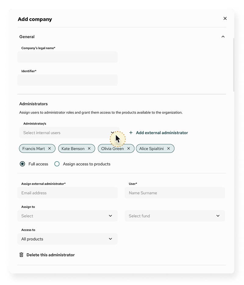
Select one or more existing users from the dropdown.
Or click + Add new administrator to manually invite one:- Required: Email, Name, Surname
- Assign to Fund
Choose the fund this company belongs to. This connects the company to fund-level views and access.
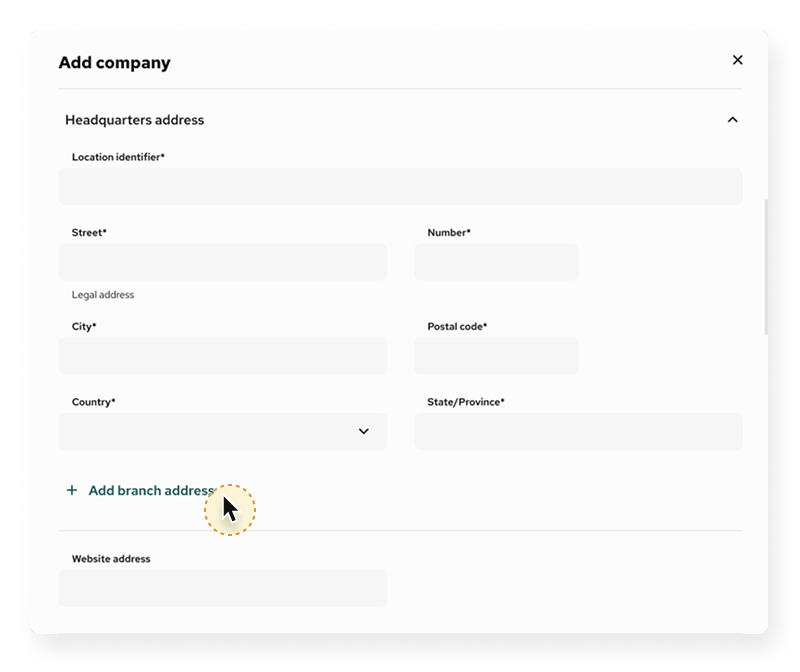
- Add company headquarters by clicking + Add branch address
- Enter address and optional Website address
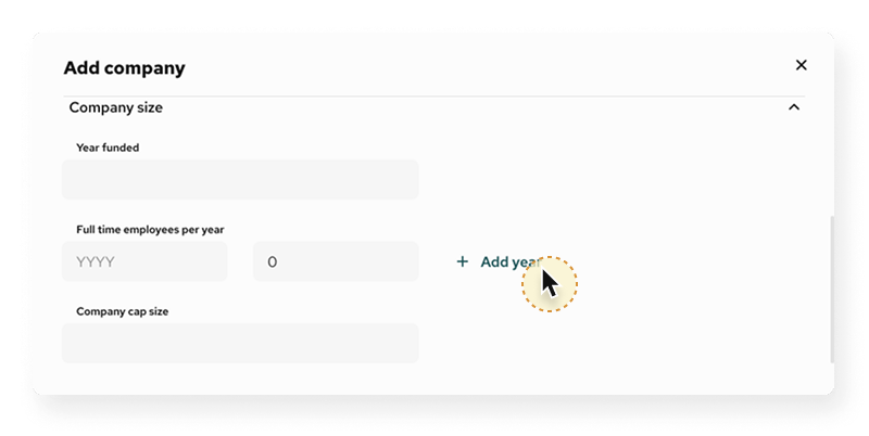
- Year founded
Enter the founding year. - Full-time employees per year
Add the number of full-time equivalent (FTE) employees for a given year.
Use + Add year to enter multiple values.
Click 🗑 to remove a year. - Company cap size
Optional free-text field to describe capitalisation or legal size.
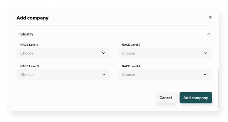
Use dropdowns to select the company’s industry classification based on the NACE code hierarchy:
- NACE Level 1
- NACE Level 2
- NACE Level 3
- NACE Level 4 (if applicable)
These are used for sector reporting and benchmarking.
Final step
Configuration
Managing administrators for portfolio companies
You can assign or update administrators either when creating a new company or when editing general data for an existing one. Administrators have access to manage company-level tasks, respond to questionnaires, and oversee submissions. Multiple administrators can be assigned to the same company.
When Adding a New Company
During company creation:
- To add someone not yet in the system, click + Add new administrator.
A form will appear where you must enter:- Email address (required)
- First name (required)
- Last name (required)
You can add multiple administrators by clicking + Add another administrator.
- New administrators will be invited via email after the company is created.
When Editing an Existing Company
To update administrator access:
- You will see currently assigned administrators with the option to remove them.
- To add new ones:
- Click + Add new administrator to open the manual input form.
- Provide the email, name, and surname.
- Click + Add another administrator to add more if needed.
- Use the trash icon 🗑 to remove any entry before saving.
- Changes will be saved once you confirm and submit the update.
Configuration
Edit Company data
The Edit Company Data function allows administrators to update both general and financial details for existing portfolio companies.
Accessing the Edit Function
Edit General Information
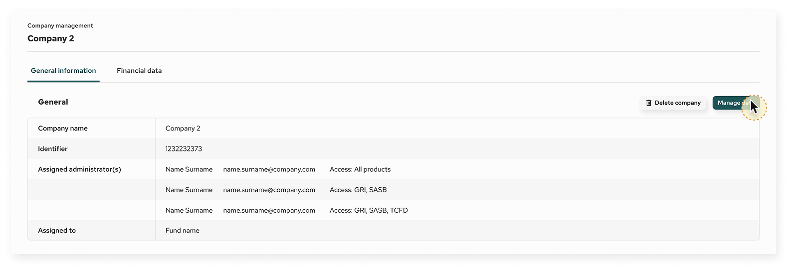
Click General Information → Manage data
This section mirrors the process used when creating a company and includes the following fields:
General Information Form
1. Company’s legal name (required)
2. Identifier (e.g. national registry number)
3. Administrators
- Select from existing users or
- Click + Add new administrator and fill in:
- Email address
- Name
- Surname
- Use + Add another administrator to add more entries
4. Assign to fund – select the relevant fund
5. Additional Information:
- Headquarter address
- Website address
- Year founded
- Full-time employees per year (add/delete years as needed)
- Company cap size
- Industry classification (via NACE Level 1–4 dropdowns)
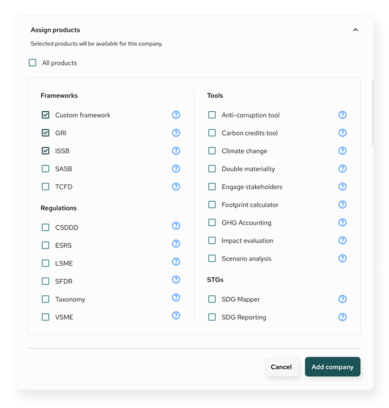
- Assign products – defines which modules will be available
Click Save to confirm your changes.
Edit Financial Data
Click Financial Data in the top tab bar. You will see a table with financial metrics by year.
You can choose to:
Manage an Existing Year
1. Click the three-dot menu beside the year
2. Select Manage data
Editable fields include:
- Invested amount (€M)
- Revenue (€M)
- Net asset value (€M)
- Current value of investment (€M)
- Committed amount (€M)
- Company valuation (€M)
- Investee Company’s Enterprise Value (EVIC) (€M)
Click Save changes when done.
Add new year
1. Click the + Add year button
2. In the modal window, choose a year from the dropdown
3. Fill in the available metrics (same as above)
4. Click + Add year to save
Delete year
- Open the three-dot menu for the selected year
- Click Delete year
- Confirm removal
Notes
- Only users with edit permissions can access this functionality
- Changes are saved in real time and reflect immediately across reporting modules
- Financial values are entered in millions of euros (€M)
- You can return anytime to update or add missing data
Questionnaire Builder
Overview
The Questionnaire Builder is a powerful tool that allows you to create, manage, and receive structured questionnaires directly within the platform. It enables you to collect non-financial data from internal and external stakeholders through a single portal, supporting the entire process of data collection, management, and reporting in a standardised and auditable way. The tool also allows you to export pre-aligned questions from universal frameworks and standards such as GRI, ESRS, and SFDR building consistency and compliance across all assessments.
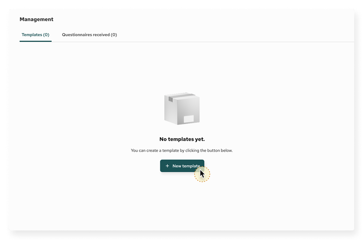
Upon accessing the Questionnaire Builder, you will land on the Management interface. This section is divided into two main tabs:
1. Templates: Here you can create new and manage existing questionnaire templates.
2. Questionnaires received: Where you can view responses submitted by external organisations
Questionnaire Builder
Starting point
When you first enter the Questionnaire Builder and no templates have been created yet, you will see a welcome screen with the message:
To begin creating your first questionnaire:
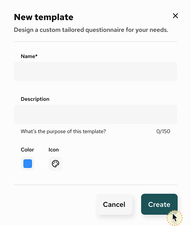
2. You will be guided through a step-by-step process to define the name, structure, and content of your questionnaire.
Questionnaire Builder
Fund level – 00: Creating a Questionnaire Template (Fund)
Questionnaire Builder
Fund level – 01: Initial Template State
Questionnaire Builder
Fund level – 02: Adding Pages and Sections
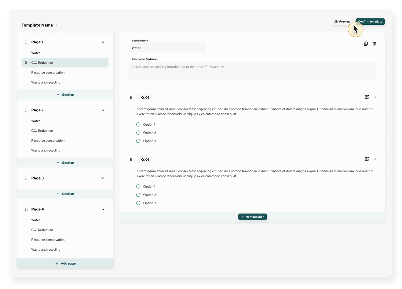
Each questionnaire is made up of pages, which can contain one or more sections.
- A Page acts like a chapter in a document — a container for multiple sections.
- A Section holds the actual questions, grouped by topic, theme, or logic.
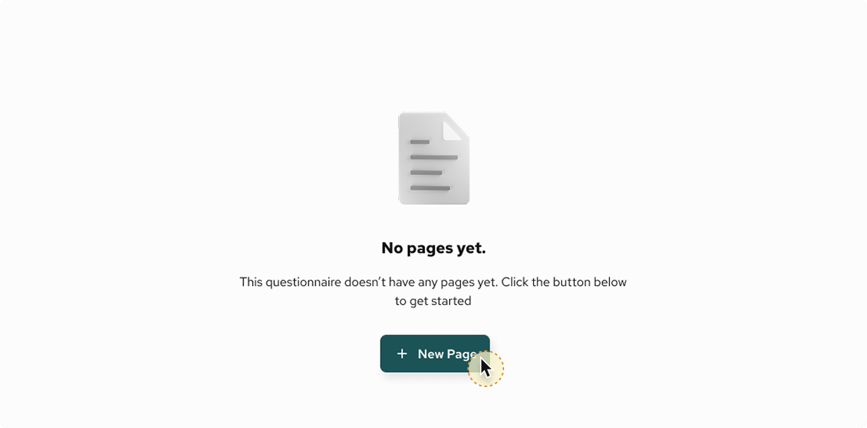
By default, the system creates Page 1 automatically. Pages cannot be deleted if they are the only one in the template.
- Rename the page using the Page name input field
- Add a brief description to guide respondents
- Click + Section to begin adding content
- Click + Add page to introduce another structural block
Questionnaire Builder
Fund level – 03: Template settings and actions
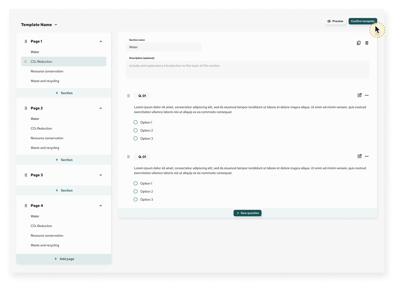
At any point during the template creation process, the following actions are available in the top-right corner:
A. Preview: Allows you to view the questionnaire as respondents will see it
B. Confirm template: Locks the structure and makes it ready for distribution (only available after at least one question is added)
C. Settings menu (3-dot icon):
- Edit details: Change name, icon or colour
- Settings: Manage template configuration
- Copy link: Create shareable preview (for internal users only)
- Publish: Mark template as ready to use
- Duplicate: Clone the template for reuse or editing
- Delete: Permanently remove the template (if not already used)
Questionnaire Builder
Fund level – 04: Adding questions to a template
Once a section has been created, you can begin adding questions using a variety of field types to match the data format required.
Each page may contain multiple sections, which are designed to group related questions.
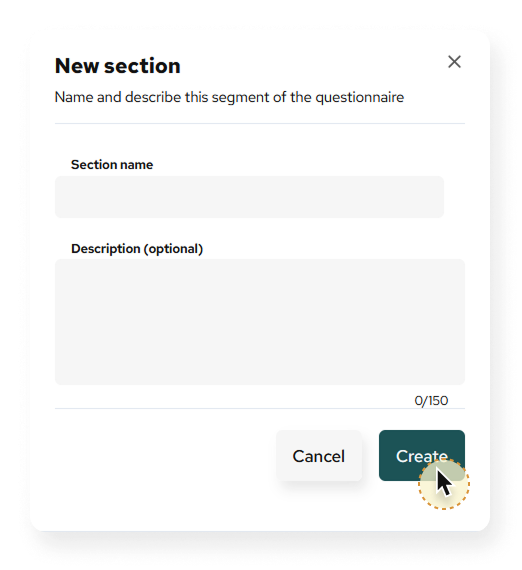
- Give the section a name
- Optionally add a description to guide respondents
Click + New question inside the section to add your first question. Each question is automatically numbered (e.g. Q.01, Q.02, etc.).
You will be prompted to:
- Write your question text
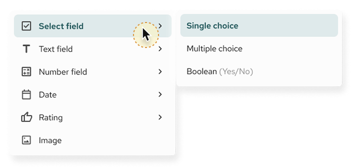
- Choose a question type from the field selector
- Save the question or cancel if not needed
To edit or delete a question, use the three-dot menu (⋮) next to the question.
The Questionnaire Builder supports a wide range of field types, grouped by function:
1. Select field
- Single choice (radio buttons)
- Multiple choice (checkboxes)
- Boolean (Yes/No)
2. Text field
- Plain text field
- Rich text field
- Description (read-only for informational text)
3. Numerical field
- Unit (e.g. tonnes, litres)
- Monetary (currency)
- Percentage
4. Date and time
- Date picker
- Year, Month
- Year-Month-Day structure
5. Rating and scale
- 5 stars
- Scale (e.g. 1 to 10)
6. Media
- Image upload (for visual responses or evidence)
Questionnaire Builder
Fund level – 05: Question saved – Reviewing and editing
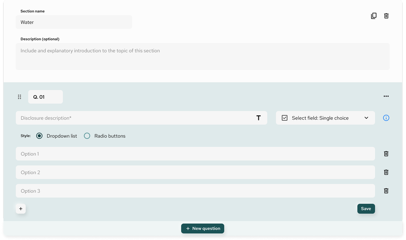
Once a question is saved, it appears directly within the section view, fully formatted and numbered. In the example shown, question Q.01 has been saved as a single choice question with three response options.
Each saved question includes:
- A unique question ID (e.g. Q.01)
- The full question text
- The response field (e.g. options for single or multiple choice)
- Action icons for managing the question
Available Actions
Hovering over or clicking the question reveals the following controls:
- Edit ✏️: Opens the question for changes
- Duplicate 📄: Creates a copy of the question (useful for reusing formats)
- Delete 🗑️: Removes the question from the template
- Drag handle (⋮⋮): Reorder the question within the section
You can continue adding more questions by selecting + New question. Each new question will be automatically numbered in sequence.
Tips for Authors
- Use short and clear text for response options
- Group related questions within a section to improve readability
- Use a mix of question types (numeric, text, Boolean, etc.) based on the kind of data you expect
Once your questions are finalised, proceed to Preview the template and then click Confirm template to activate it for sending.
Questionnaire Builder
Fund level – Question type: Selection fields
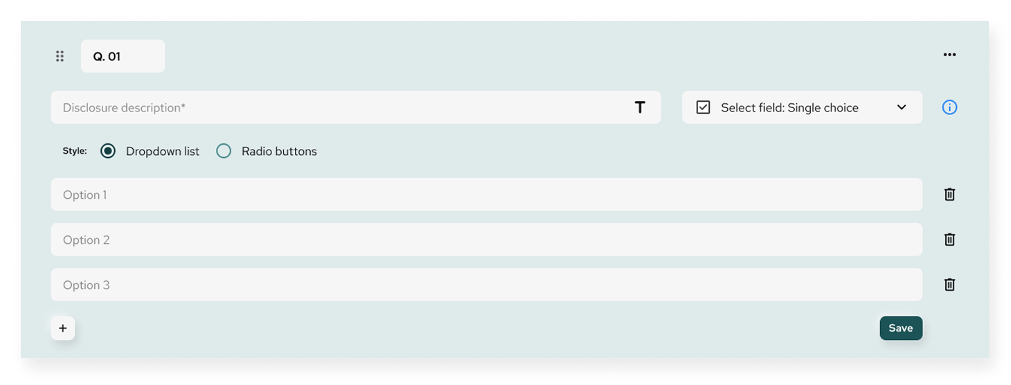
The Select field is designed for structured responses based on predefined options. It supports three formats: Single choice, Multiple choice, and Boolean. Each of these allows you to control how respondents interact with a question.
Allows the respondent to select only one answer from a predefined list.
Configuration:
- Disclosure description: Write the question or prompt
- Style options:
- Dropdown list (compact and clean for many options)
- Radio buttons (recommended for short, visible lists)
- Add options one by one (e.g. Option 1, Option 2, Option 3)
- Save to apply the configuration
End-user view:
- Dropdown appears with single-select behavior or
- Radio buttons show all options inline
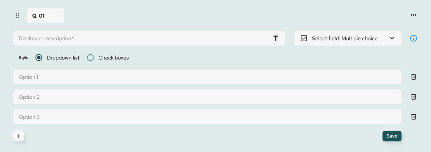
Allows the respondent to select more than one answer.
You will be prompted to:
Configuration:
- Same as Single Choice:
- Disclosure description
- Choose between Dropdown list or Check boxes
- Add multiple selectable options
- Save once all options are defined
End-user view:
- Dropdown with multi-select capability or
- List of checkboxes, each representing an option
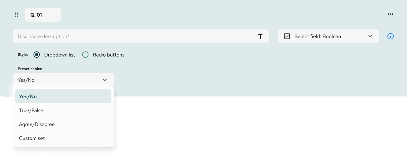
Boolean questions simplify binary choices.
Configuration:
- Disclosure description
- Choose style: Dropdown list or Radio buttons
- Preset choices:
- Yes/No
- True/False
- Agree/Disagree
- Custom set (define your own labels, e.g. “Compliant” / “Non-compliant”)
End-user view:
- Compact dropdown or
- Inline radio buttons (e.g. Yes / No)
Tips for Select Fields
- Use Single choice when only one option makes sense (e.g. “Which region are you located in?”)
- Use Multiple choice for multi-selectable categories (e.g. “Which certifications do you hold?”)
- Use Boolean for clear, binary outcomes (e.g. “Is the site ISO-certified?”)
Each field is saved individually and can be edited or reordered at any time.
Questionnaire Builder
Fund level – Question type: Text Field
Text fields are used when the respondent needs to provide an open-ended answer. The Questionnaire Builder offers three text field options: Plain text, Rich text, and Description (Read only).
The Plain text field allows respondents to enter short, unstyled answers — ideal for identifiers, short descriptions, or direct responses.
Configuration:
- Add a disclosure description (the question or instruction)
- Select Plain text field from the dropdown
- Save the field to display it in the section
End-user view:
- Simple one-line input box
- Clean and minimal user interface
- Ideal for fields like: “Name of facility”, “Country of incorporation”, “Main product”
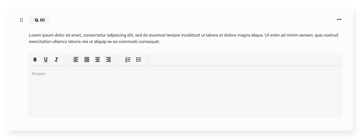
The Rich text field enables longer responses with formatting options. Use this when a respondent needs to elaborate or structure a response.
Configuration:
Add a disclosure description
Choose Rich text field
Save to display
End-user view:
- Text box with formatting toolbar:
- Bold, italic, underline
- Bullet lists, numbered lists
- Text alignment (left, center, right)
- Ideal for: “Describe your climate strategy”, “Provide commentary on ESG performance”, etc.
This field is used not for collecting input, but to provide informational text or instructions within the questionnaire.
Configuration:
- Add a label or note in the description box
- Select Description (Read only) field type
- Save
End-user view:
- Static text display
- No input expected from the respondent
- Common use cases:
- Section instructions
- Notes explaining terminology
- Visual dividers between groups of questions
Tips for Using Text Fields
Use Plain text for short, factual answers
Use Rich text when formatting or detailed responses are expected
Use Description to guide or inform without requiring input
You can mix all three field types within the same section or page depending on your content needs.
Questionnaire Builder
Fund level – Question type: Numerical fields
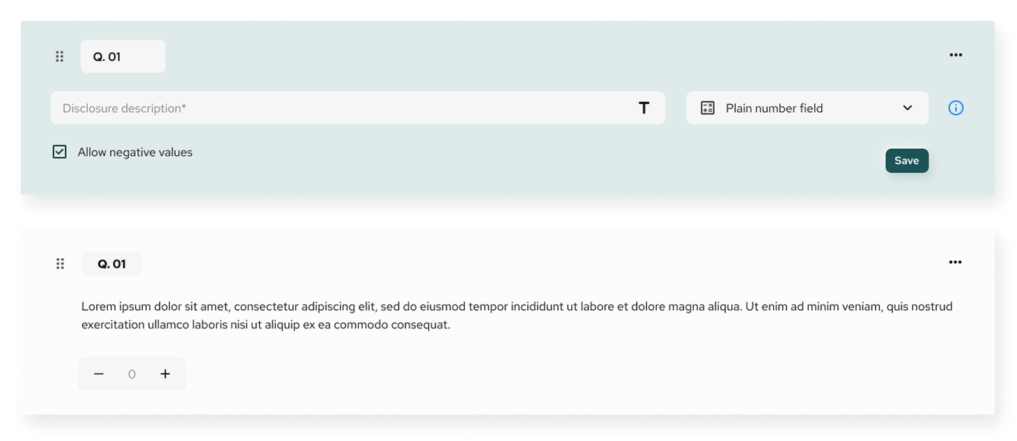
Number fields are used to collect quantitative responses. The Questionnaire Builder provides three variants: Plain number field, Unit, and Percentage — each adapted for specific data types.
This field allows users to input numeric values with basic formatting.
Configuration:
- Add a disclosure description
- Select: Plain number field
- Option: enable “Allow negative values” for datasets such as financial losses, emissions reduction, etc.
- Save the field
End-user view:
- Increment/decrement arrows for value selection
- Negative input is allowed if the toggle was enabled
- Suitable for: “Number of employees”, “Total production volume”, etc.
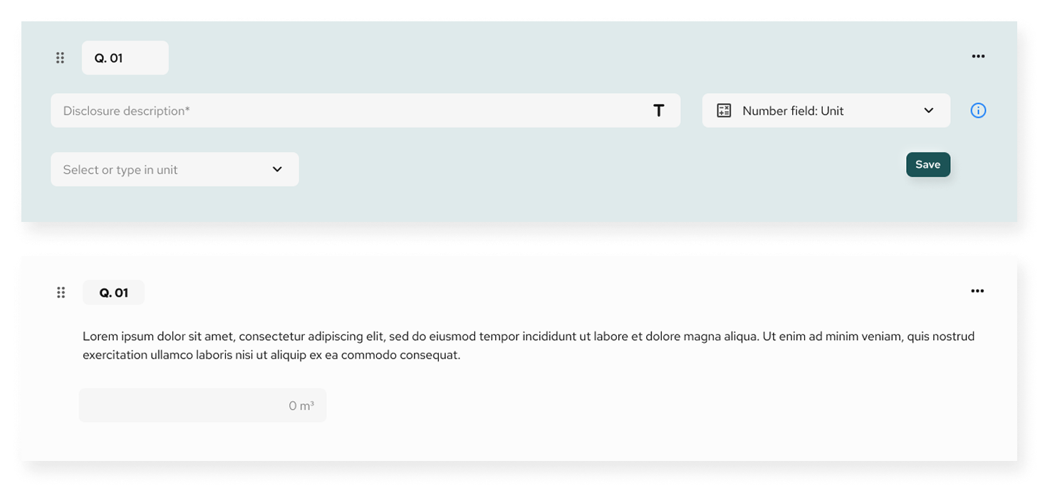
This field collects numeric values with a measurable unit (e.g. m³, kg, CHF).
Configuration:
Enter the disclosure description
Select Number field: Unit
Define the unit label (can be pre-filled or typed manually)
Save
End-user view:
Number field followed by a unit label (e.g. 1200 m³)
Suitable for: “Water consumption”, “Waste generated”, “Revenue in CHF”
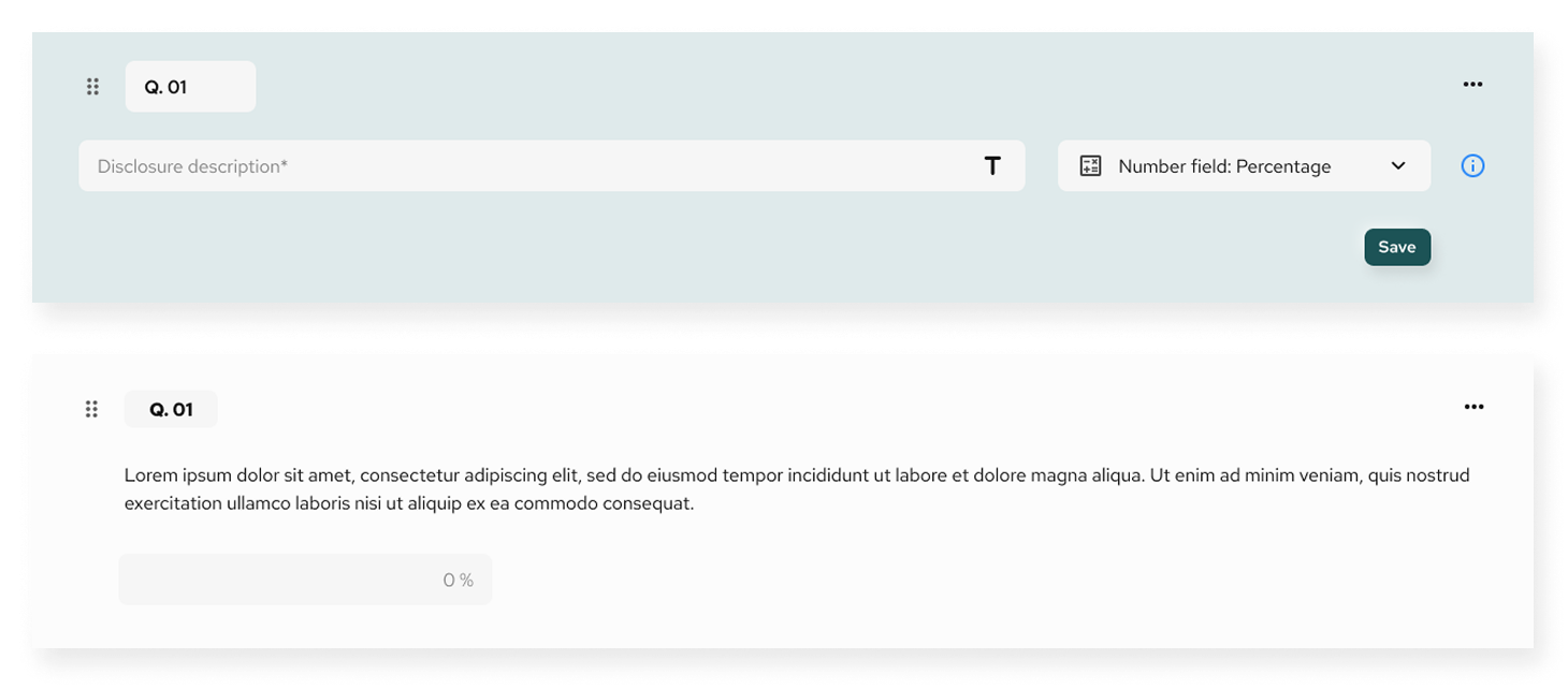
Used when a response must be expressed as a percent value.
Configuration:
- Write the disclosure description
- Select Number field: Percentage
- Save the field
End-user view:
- Numeric input with % symbol appended
- Useful for: “Percentage of renewable energy used”, “Women in leadership roles (%)”, etc.
Tips for Using Number Fields
- Plain number is ideal for raw counts or financial values
- Use Unit to avoid confusion about measurement context
- Apply Percentage when benchmarking or performance tracking
- Activate “Allow negative values” when appropriate (e.g. carbon offsets)
All number fields are validated to ensure input correctness and formatting, enhancing the reliability of collected data.
Questionnaire Builder
Fund level – Question type: Date fields
Date fields are used to collect temporal data — either a single point in time or a time range. The Questionnaire Builder offers three formats for date input: Year, Year-Month, and Year-Month-Day.
Each format allows selection of either:
- A single date
- A range of dates
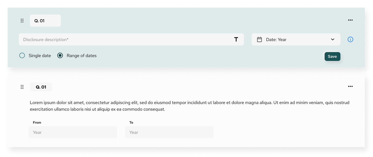
This is the most basic date format, allowing the respondent to select or input a single year.
Configuration:
- Add a disclosure description
- Select Date: Year
- Choose between Single date or Range of dates
- Save the question
End-user view:
- Dropdown field with year selector
- If using a range, two fields will appear: From and To
Example use cases:
- “What year was the facility established?”
- “Report emissions from 2022 to 2023”
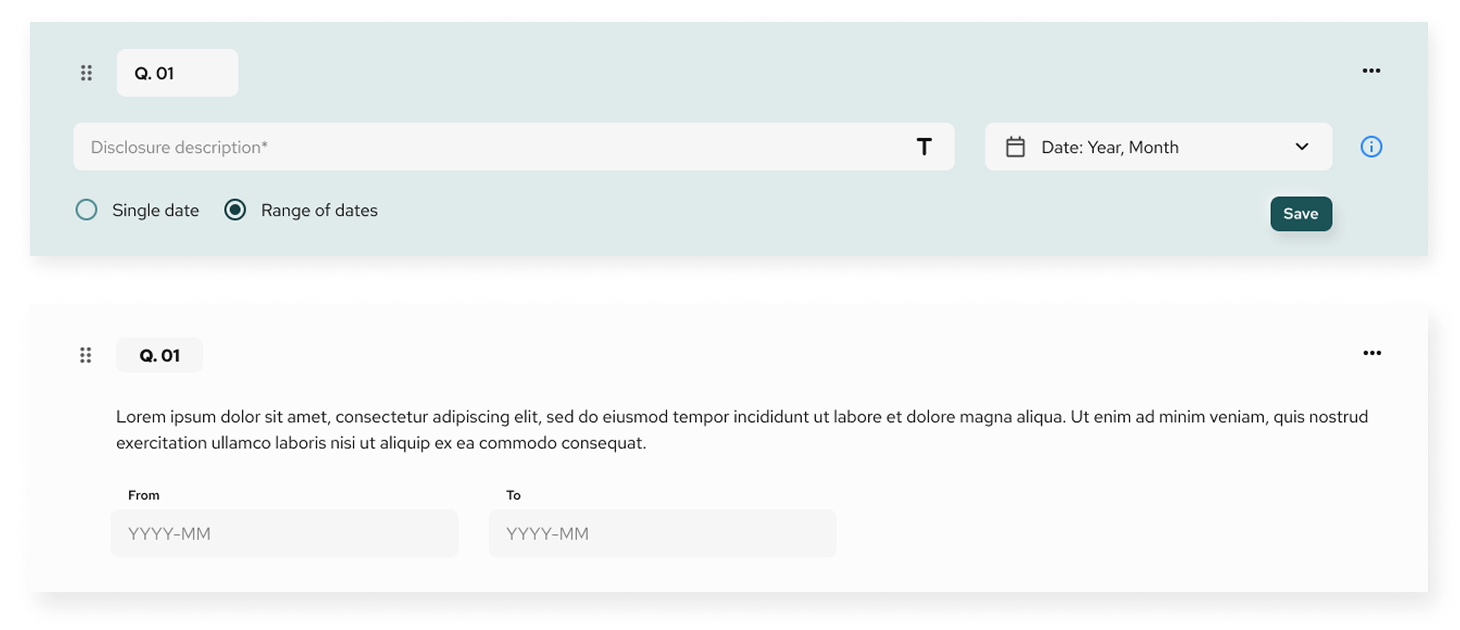
Allows the respondent to provide more granular date input, including the specific month.
Configuration:
- Select Date: Year, Month
- Choose between Single date or Range of dates
- Save
End-user view:
- Input in YYYY-MM format
- Calendar picker assists the user
Example use cases:
- “Select the month of last audit”
- “Period of production activity”
This is the most precise date format and includes full calendar date selection.
You will be prompted to:
Configuration:
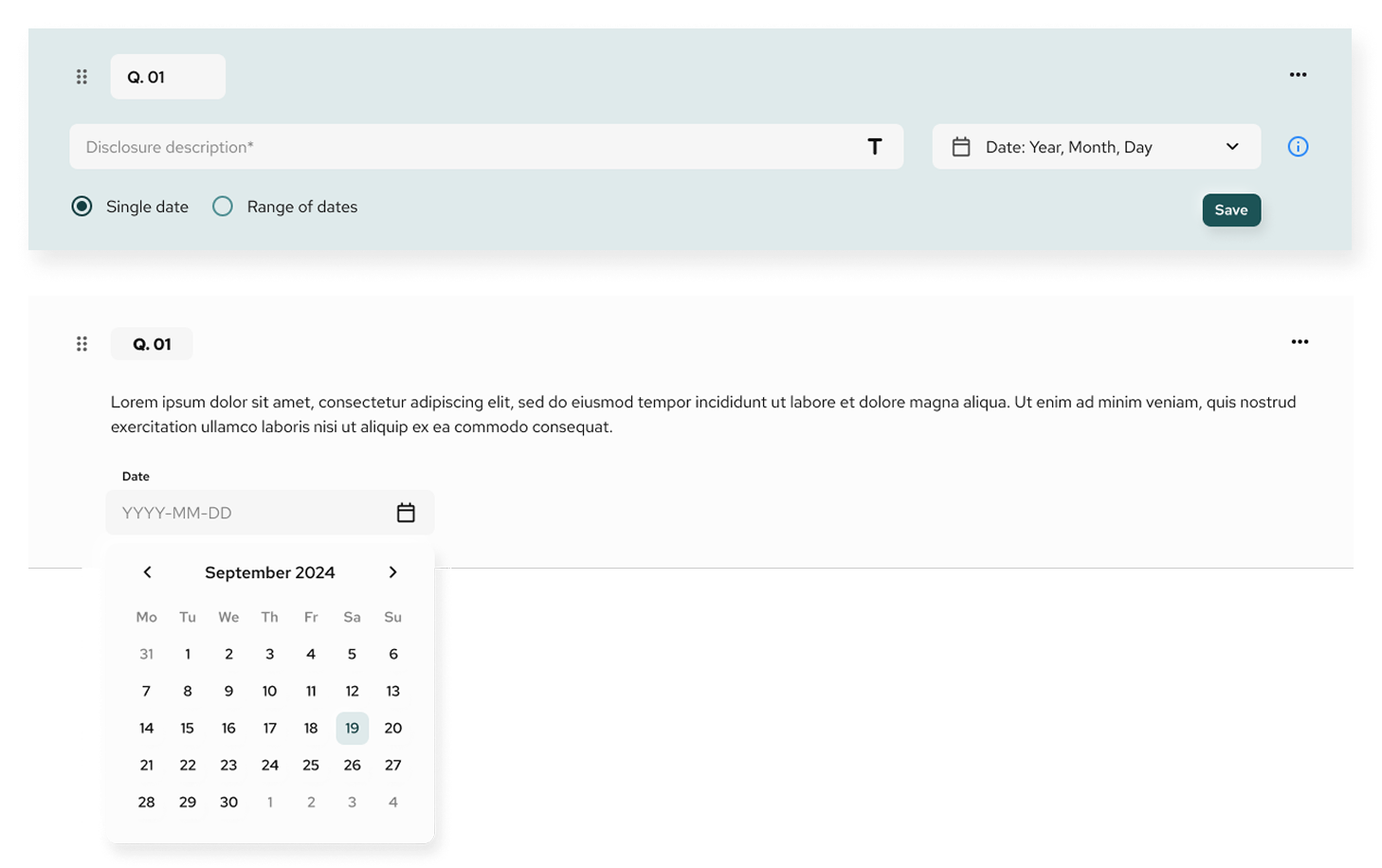
- Select Date: Year, Month, Day
- Choose between Single date or Range of dates
- Save
End-user view:
- Users interact with a calendar-style date picker
- Range format displays From and To fields
Tips for Using Date Fields
- Choose the simplest format that meets your reporting needs to avoid overburdening the respondent
- Use range mode when comparing periods or reporting over time
- Combine date fields with text or numeric questions for contextual answers (e.g. financial year and total revenue)
Questionnaire Builder
Fund level – Question type: Rating field
The Rating input allows users to respond to a question using a fixed scale, either via stars or descriptive labels. This input is best used for subjective assessments (e.g. satisfaction, likelihood, performance) where numeric or qualitative scoring is relevant.
Types
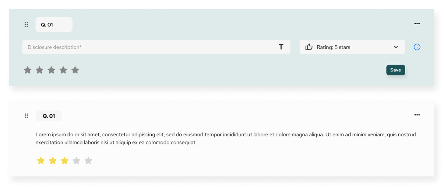
Displays a horizontal row of five clickable stars. Each selected star represents an increasing score from 1 to 5.
- Use case: Quick qualitative feedback (e.g. satisfaction, usefulness).
- Display options: Stars only, no additional labels.
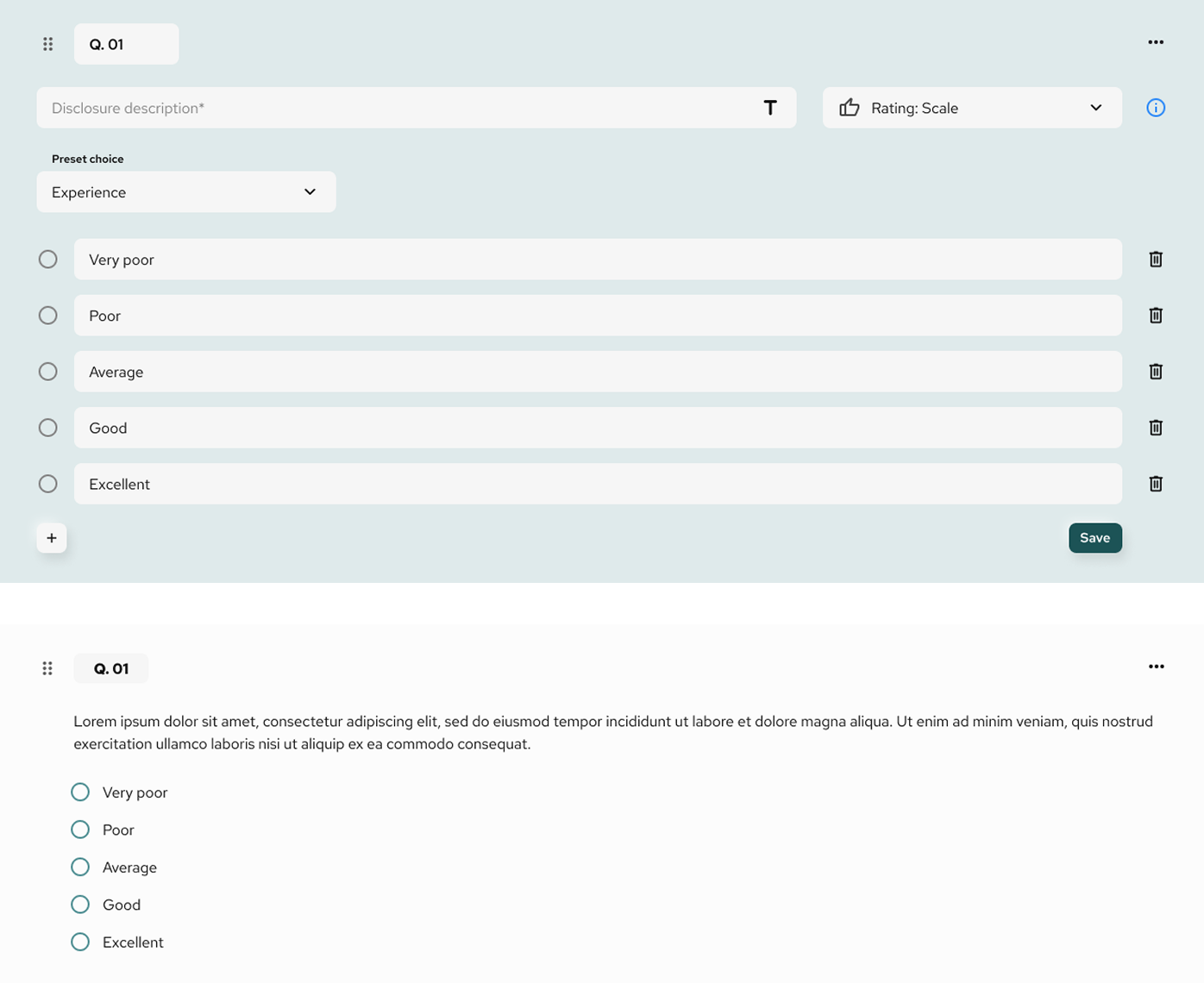
Offers a set of predefined or custom descriptive options presented as radio buttons.
- Preset choices:
- Agreement (e.g. Strongly disagree → Strongly agree)
- Experience (e.g. Very poor → Excellent)
- Impact (e.g. None → Very high)
- Importance (e.g. Not important → Very important)
- Likelihood (e.g. Very unlikely → Very likely)
- Satisfaction (e.g. Very dissatisfied → Very satisfied)
- Performance (e.g. Very poor → Excellent)
- Users may also manually create their own scale by editing each option.
- Use case: Structured evaluation based on user perception or judgment.
Configuration
- Disclosure description: Optional explanatory text to guide the user.
- Preset scale selection: Admin can choose from predefined scales or build a custom one.
- Option management: Options can be added, removed, or reordered by the admin.
- Response view: In the final user interface, only the selected label or number is shown.
Output
- For 5-star rating, a numeric value from 1–5 is stored.
- For rating scale, the selected label is saved as a string (e.g. “Neutral”, “Very high”).
Questionnaire Builder
Fund level – Question type: Image input
The Image input allows users to upload visual content to support or illustrate their responses. This field is useful for attaching evidence, diagrams, scanned documents, or any visual verification required in the questionnaire.
Types
Accepted formats
- Supported file types: JPEG, PNG, TIFF, BMP, HEIF/HEIC, SVG
- Max file size: 30 MB per image
Configuration
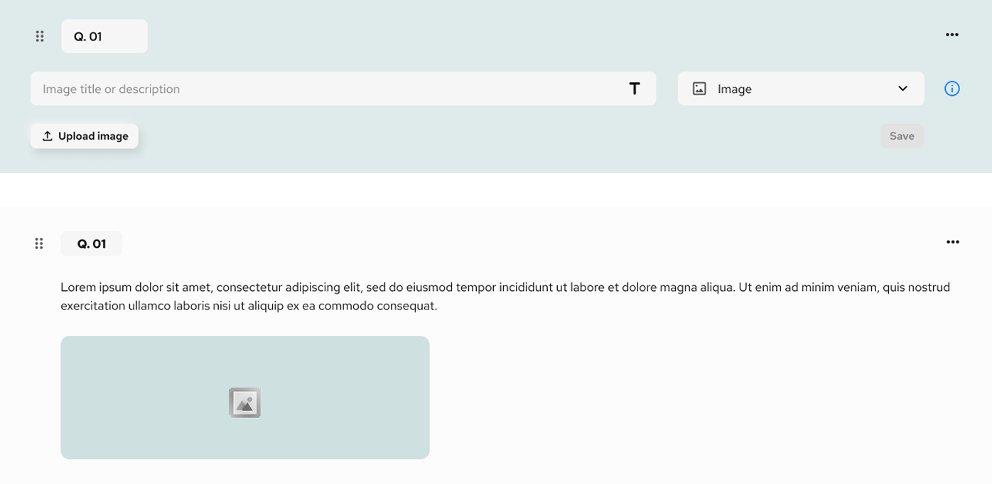
- Image title or description: Optional text field where the respondent can provide a short label or context for the uploaded image.
- Upload button: Triggers the file picker and allows users to select and attach an image.
- Preview & delete: Once uploaded, a thumbnail preview is displayed along with an option to remove the image before saving.
- Only one image can be uploaded per input field.
- Upload is disabled until a file is selected.
- If no image is uploaded, the field remains empty.
Use cases
- Uploading evidence of compliance (e.g. certificates, screenshots, physical proof)
- Attaching supporting visual material (e.g. floorplans, graphs, product labels)
- Collecting visual data for manual or automated review
Questionnaire Builder
Fund level – 06: Confirm template
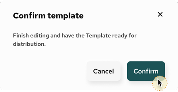
The Confirm template function finalises the structure and content of a questionnaire. Once confirmed, the template becomes locked for editing and is ready to be distributed to respondents.
When clicking the Confirm template button, a confirmation modal appears with the following options:
- Cancel: Return to the editor to continue making changes.
- Confirm: Finalise the template and mark it as ready for use.
Behaviour
- Once confirmed, the template cannot be edited unless it is duplicated or unlocked by a system administrator.
- Confirmation is required to ensure the integrity of the questionnaire before distribution, especially in compliance or audit-driven contexts.
Use cases
- Locking a standardised assessment before distributing it to multiple entities.
- Finalising regulatory or ESG templates to prevent accidental modifications.
- Preparing a version-controlled format for consistent data collection.
Creating portfolio companies
Locate the Admin section in the left-hand sidebar menu.
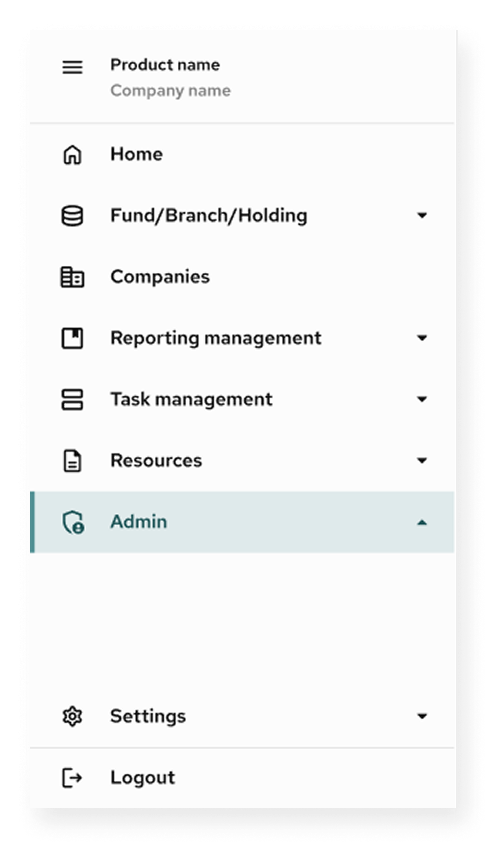
Creating portfolio companies
Selecting Company management.
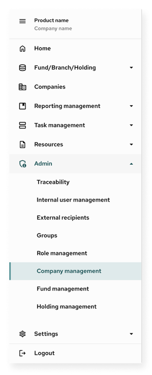
Creating portfolio companies
No companies registered yet.

Creating portfolio companies
Some companies already registered.

Adding portfolio companies
Company details
Adding portfolio companies
2. Headquarters address
Adding portfolio companies
3. Company size
Adding portfolio companies
4. Industry classification
Adding portfolio companies
5. Assign products
Adding portfolio companies
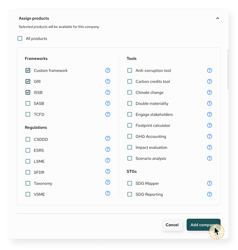
Final step
Managing administrators for portfolio companies
Select one or more users from the existing administrator list.
Managing administrators for portfolio companies
Select one or more users from the existing administrator list.

Managing administrators for portfolio companies
Managing administrators for portfolio companies
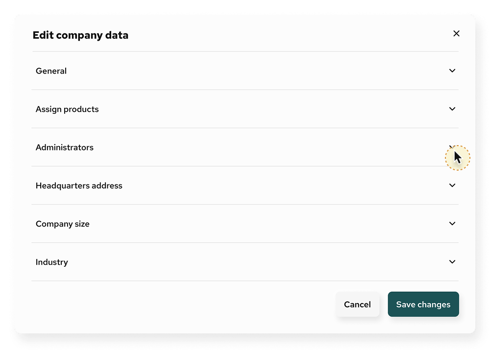
Edit company data
Accessing the editing function
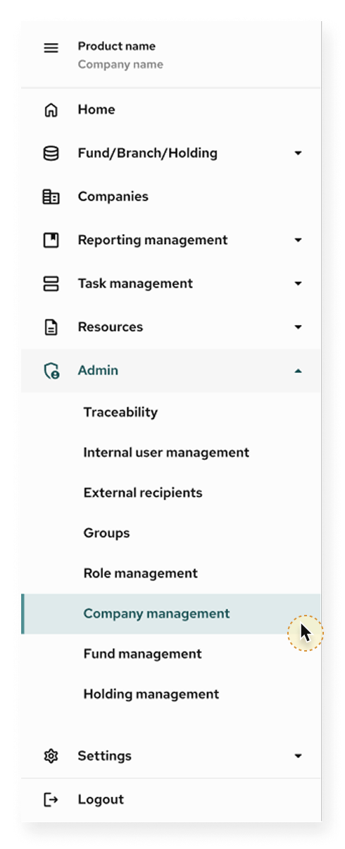
Edit company data
Accessing the editing function

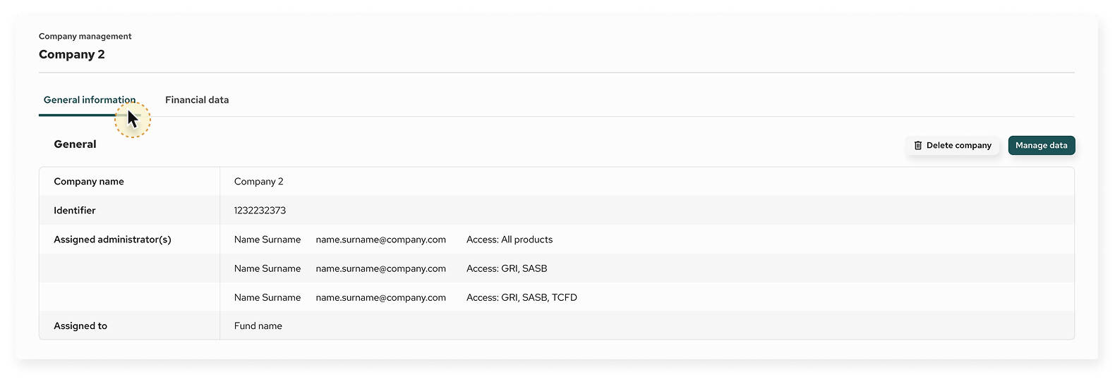
Overview
Management interface
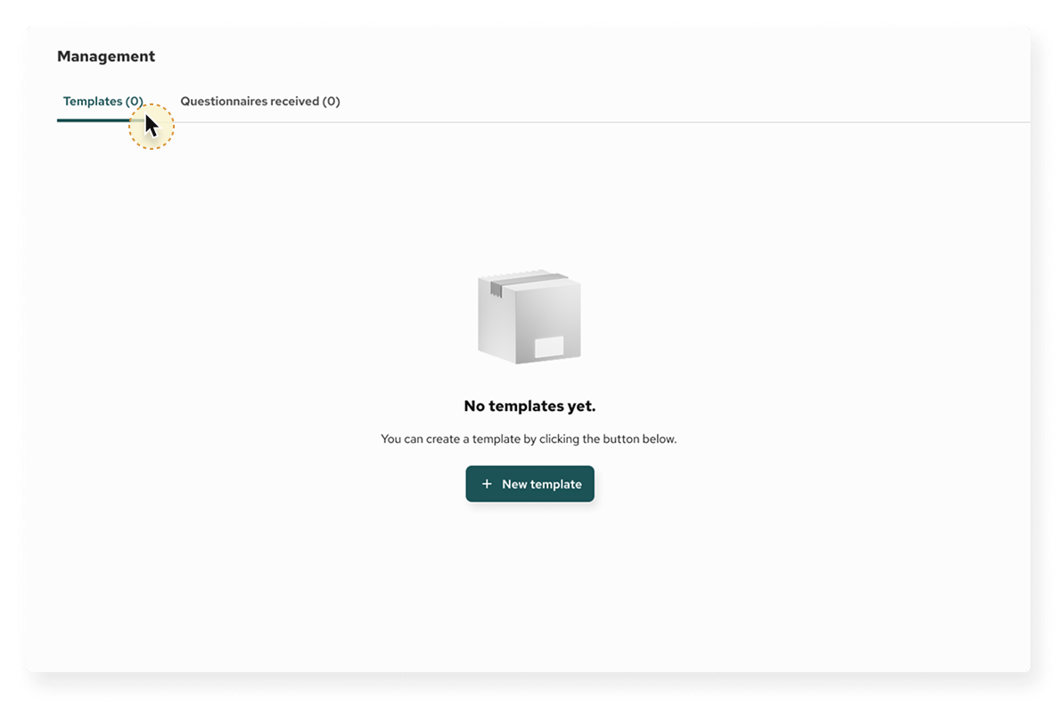
Starting point
Creating a new template for the first time.
Starting point
Creating a new template.

Fund level
Creating a Questionnaire Template (Fund)

Fund level
If all pages have been deleted, and empty template will show the following message.
Adding Pages and Sections
Pages and sections

Template settings and actions
Preview, confirm template and settings
Adding questions to a template
Create a section

Add a question
Add a question

Selecting a question type
Selecting a question type
Question saved – Reviewing and editing
A question saved in review/edit mode.

Question type: Selection fields
Single choice


Question type: Selection fields
Multiple Choice


Question type: Selection fields
Boolean


Question type: Text Field
Plain text field
Question type: Text Field
Rich text field
Question type: Text Field
Description (Read only)

Question type: Numerical Field
Plain number field

Question type: Numerical Field
Number field with unit
Question type: Numerical Field
Percentage
Question type: Date Field
Date (Year Only)
Question type: Date Field
Date (Year and Month)
Question type: Date Field
Date (Year, Month, Day)
Question type: Rating
5 Stars
Question type: Rating
Scale
Question type: Image input
Loading an image as part of the question.
Confirm template
Finalizing the templates structure
